|
An Optimization Graph window appears when you select Show Optimization Graph from the Results Menu or press the .png) button on the Tool Bar. button on the Tool Bar.
It graphs the values of one Results column across every test in the Results window. The tabs across the top of the window (or the Left and Right arrow keys) switch which column is being graphed.
Seven graph types are available. Select one from the ResGraph menu, from the Options dialog, or directly by pressing its shortcut key:
Bar Chart (B) - one bar per test, labeled with the parameter values that produced it
Heat Map (H) - a grid of cells for two parameters at once, colored by value
3D Surface (3) - the heat map grid drawn as a rotatable three-dimensional surface
Histogram (M) - the distribution of the column's values across all tests, with the selected test highlighted as the baseline
Equity Curves (E) - the combined equity curve of every test, overlaid on one date axis
Drawdown Curves (D) - the combined drawdown curve of every test, overlaid on one date axis
Overfitting Analysis (F) - the most recent optimization run with OptOverfit enabled, in two tab views: Selection (CSCV/PBO) and Surface (Walk-Forward Correlation); F again switches between them - see Overfitting Analysis
Bar Chart
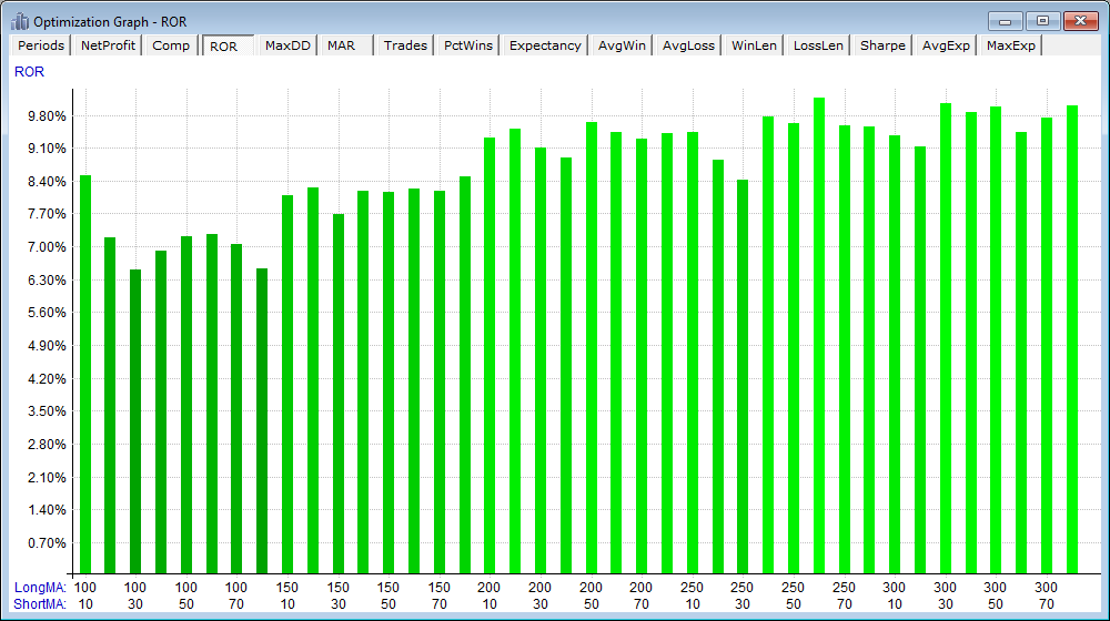
Each bar is one test, with the value of every varied parameter shown beneath it. Hover over a bar to see its exact parameter values and result. Sort Columns (S) orders the bars by value rather than by parameter, which makes the range of outcomes easier to judge. Linear Regression Line (L) overlays a trend line.
Heat Map
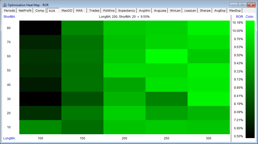
When two or more parameters were varied, the heat map shows one parameter per axis with each cell colored according to the value scale on the right. Choose which parameters to map using the X-Axis and Y-Axis submenus of the ResGraph menu, or the Options dialog. Colors run from pale near zero to deep green (positive values) or deep red (negative values) far from zero. Hover over any cell for its exact values, or press V (Show Values) to draw every cell's value in the cell; the values are drawn only when the cells are wide enough to hold them. Show Data on the ResGraph menu opens the same grid as a table (one row per Y-axis value, one column per X-axis value) that can be copied into a spreadsheet.
3D Surface
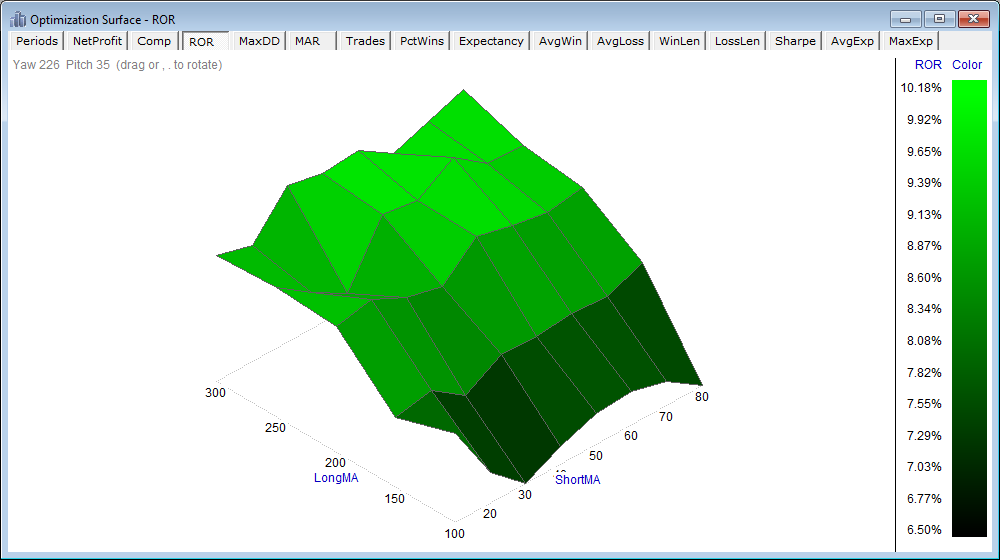
The same grid as the heat map, drawn as a surface. Drag with the mouse to rotate it freely, or press the , and . keys to rotate in 15-degree steps. The viewing angle is remembered between sessions. A robust parameter neighborhood appears as a broad plateau; a lone spike suggests an over-fit combination.
Histogram
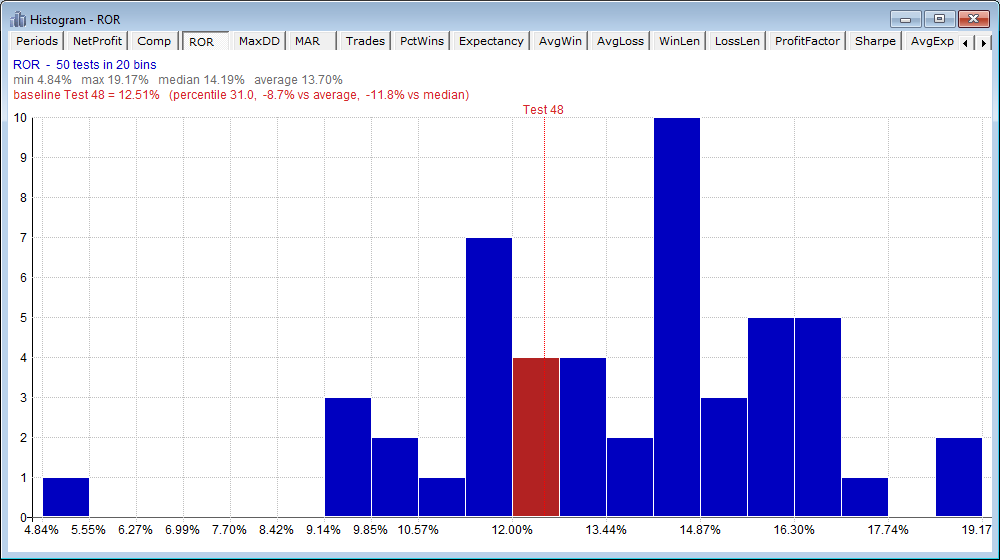
The histogram divides the value range of the current column into bins and counts how many tests land in each - the distribution of outcomes across the whole optimization. It is made for parameter sensitivity analysis: run an optimization that varies your parameters around their chosen values, then see where those chosen values fall in the range of possible outcomes. Hover over any bar for its exact value range and test count.
One test is the baseline - normally the test that used your chosen parameter values. Its bin is drawn in red with a dotted marker line, and the header shows its value, its percentile rank, and its difference from the average and median of all tests. The baseline is simply the selected row of the Results window: click a different row, or press the Up and Down arrow keys on the graph, to move it. A baseline near the middle of the distribution suggests the outcome is typical of the whole parameter neighborhood; one in the top few percent may owe more to a lucky parameter draw than to the strategy - see Overfitting Analysis for a complementary test of the same question.
The number of bins is chosen automatically from the test count; the Bins option in the Options dialog sets a fixed count instead (0 = automatic).
Log Summary Text on the ResGraph menu writes a tab-delimited table to the Log window with one row per results column: the minimum, maximum, median, average and standard deviation across all tests, plus the baseline's value, percentile rank, and differences. Paste it into a spreadsheet for further analysis.
Equity and Drawdown Curves
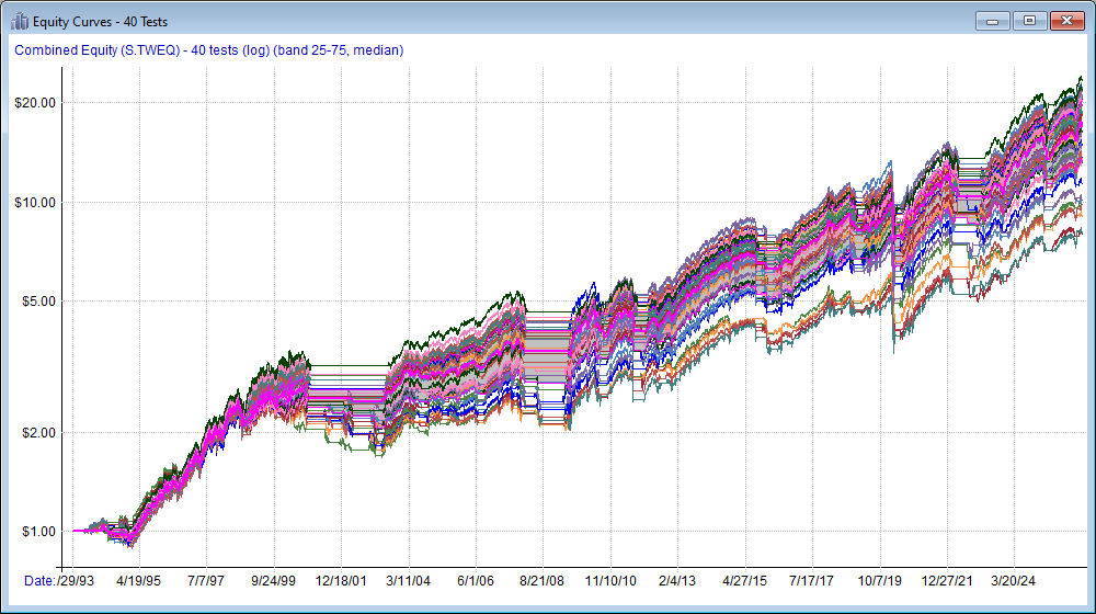
Equity Curves draws the combined equity of every test in the list (the S.TWEQ daily series) as its own line on a merged date axis - a direct view of how sensitive the strategy's outcome is to parameter choice. Log Scale (G) switches the equity axis to logarithmic. Percentile Band (P) shades the 25th-75th percentile range and draws the median path in magenta, as shown above.
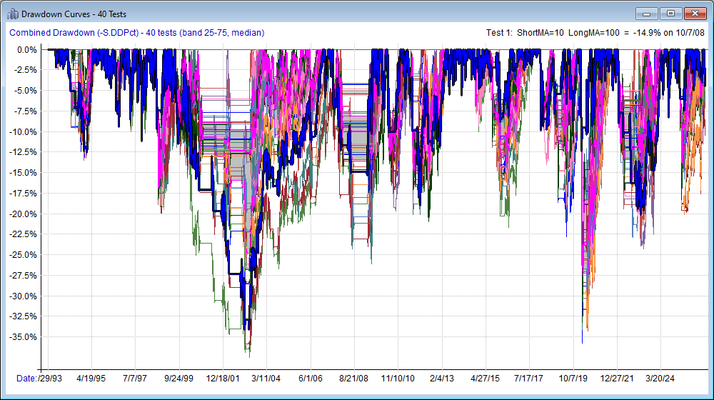
Drawdown Curves is the same view of each test's combined drawdown (S.DDPct).
Hovering over either curve graph highlights the nearest curve and shows its test number, parameter values and final value; clicking selects that test's row in the Results window, so you can pull any interesting line out of the bundle for closer study.
The curve graphs need the per-period stats of each test, so they are not available for results that were saved with Discard Stat Details (OptNoStats). Press ESC to cancel drawing the curves of a very large results list.
Averaging Method
When more than one test shares the same X-axis (and Y-axis) parameter values - for example when a third parameter was also varied, or Test Iterations was greater than one - each bar, cell or surface point aggregates those tests. The Averaging Method option chooses how: Mean (the default), Median, Minimum or Maximum. Hover readouts indicate how many tests went into the value, e.g. "(avg of 5)".
Options and Images
Press O (or choose Options from the ResGraph menu) to open the Optimization Graph Options dialog, which collects every choice in one place. The options are grouped by the graph type they apply to, and the group captions for the currently selected type are shown in bold; the Dark Background option applies to all types. All settings persist between sessions.
Ctrl+C copies the current graph to the clipboard as an image, and Save Image as PNG File on the ResGraph menu saves it to disk.
If you haven't already done so, please go through Tutorial 2 for a worked optimization example.
|

